Forter
Transforming the visual identity and brand experience
Creative Director & UX/UI Designer
Introduction
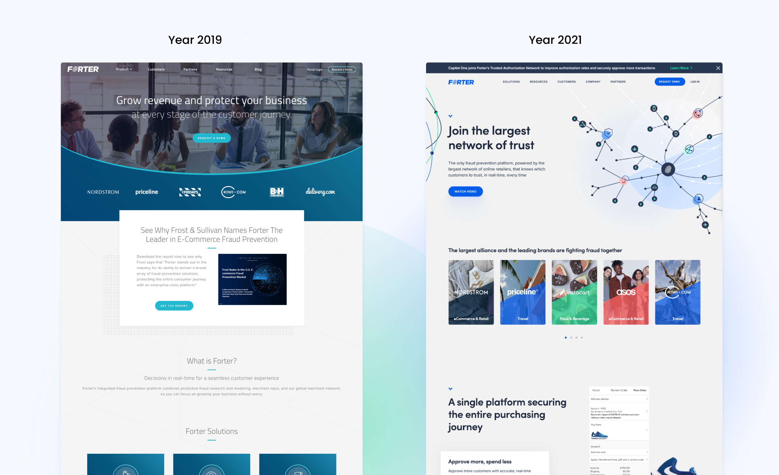
In the digital world, Forter shines as a beacon of trust and innovation, redefining fraud protection for businesses. Despite its advanced B2B SaaS offerings aimed at fostering trust and secure transactions, Forter has faced challenges. A complex user flow and dated look have skewed its brand image, causing a gap between its innovative solutions and market perception. This discrepancy has hindered potential partners' understanding and trust in Forter's capabilities, challenging its mission to safeguard digital commerce trust.
Goals & Objectives
Revamp its look and website to better show off its innovative spirit and connect with business partners.
Boost teamwork across design, executive, marketing, and product teams for a stronger, unified brand.
Improve user experience to keep visitors on the site longer and turn more of them into leads.
Become the top name in fraud protection, boosting its reputation in the digital market.
Challenges
Updating the user experience and design, stuck in old ways from past agency work.
The need for a design that's not just pretty but also aligns with marketing strategies, all under tight deadlines and high executive expectations.
Stakeholder and product team buy-in
Solutions and Implementation
We’ve tackled these issues by:
Clearly defined user-personas and implemented atomic design approach
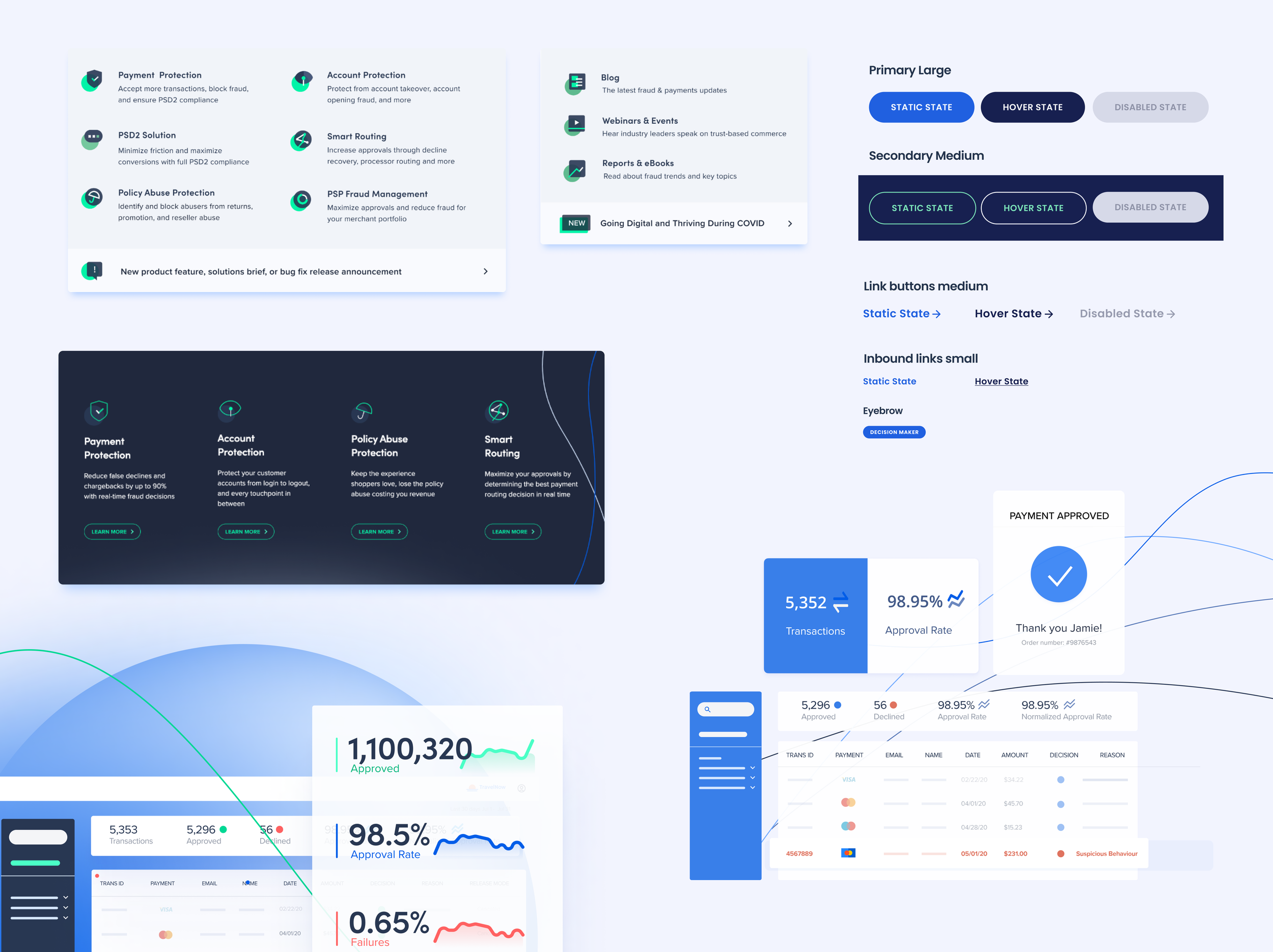
Adopting a user-friendly design, focusing on easy navigation and modern, appealing visuals, choosing lively colors and graphics that fit its vibe.
Weaving its story into everything, from marketing materials to the website, making sure visitors get the full picture of Forter's mission and values.
Brand Essence: We started by thoroughly understanding Forter's core values and mission. What does Forter stand for? What are its long-term goals? Understanding these elements was crucial in ensuring that the new visual identity resonated with both the company's ethos and its audience.
Brand Promise: We articulated Forter's brand promise – a commitment to providing secure, real-time solutions in digital commerce. This promise became a guiding beacon for all design and messaging decisions.
Messaging: Forter messaging is clear and value-focused, highlighting the real-world benefits of their products and services. We aimed to inform and resonate with our audience's needs, fostering a connection with our brand.
Brand strategy
Design concept
Visual Identity Development: Our design's heartbeat was to showcase Forter as a hub of digital trust, connecting merchants and enterprise brands across various sectors. We used lines to symbolize connections and circles for unified data points. The color palette shifted from drab to dynamic, making Forter pop in a crowded B2B space.
UX/UI
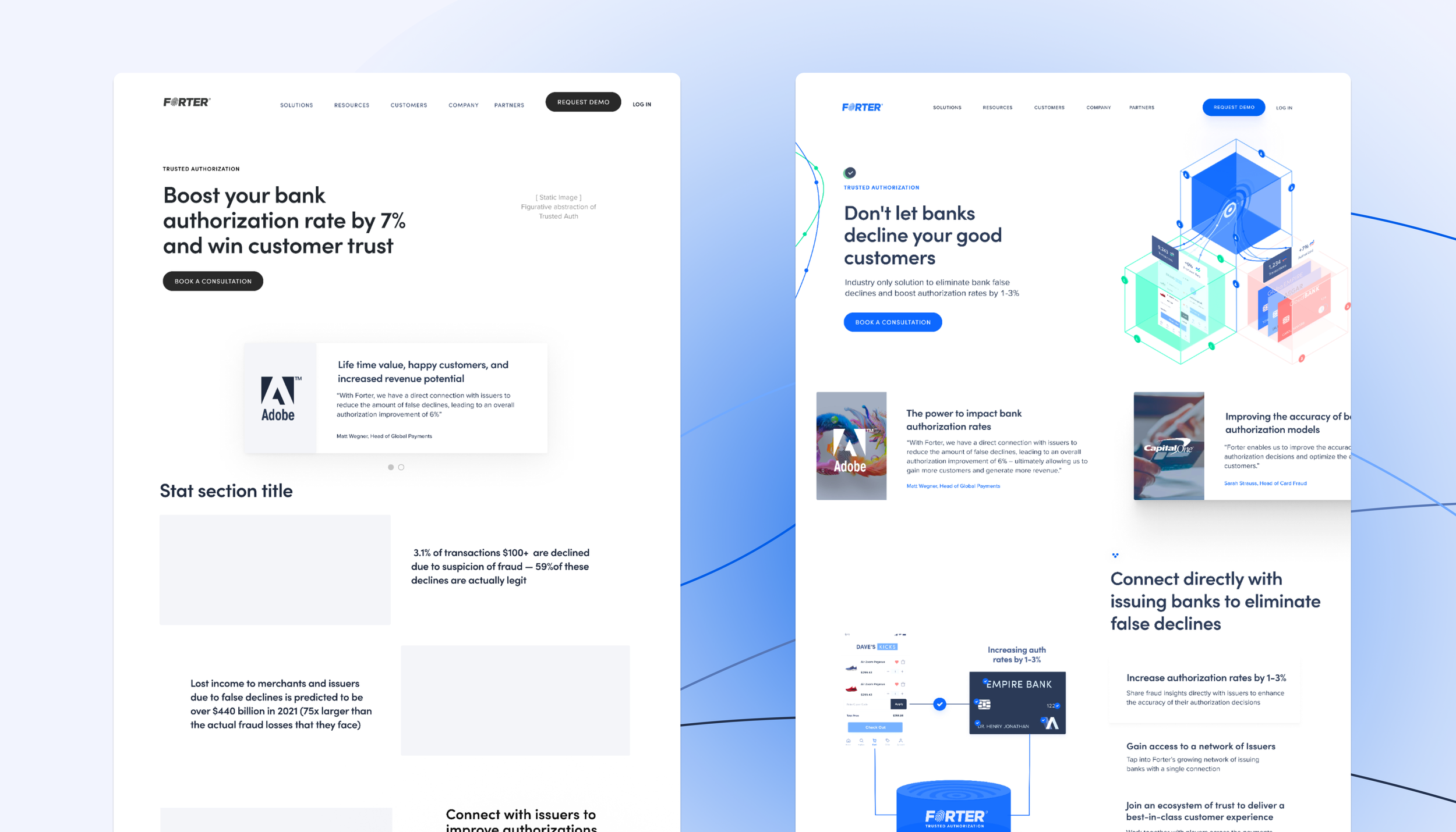
Through an in-depth exploration of our users' needs, pain points, and interests in collaboration with the product team, we have re-envisioned the site architecture and user flows. This redesign aligns seamlessly with our marketing strategy and leverages insights from product development, resulting in a cohesive and purposeful user journey.
The strategic redesign initiative bore fruit in the form of a dramatically enhanced user experience, marked by a remarkable 37% reduction in drop-off rates. Furthermore, Forter witnessed a substantial 24% increase in qualified leads, indicative of the success of the new brand identity and website in engaging and converting potential partners. This revitalization has not only bolstered Forter's market position but has also redefined its brand perception, casting it unequivocally as a leader and innovator in the realm of digital commerce fraud protection.


